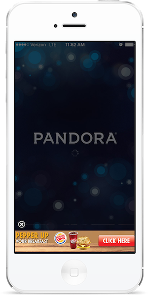
Mobile banner ads need to make a very big impression on a fairly small screen, and they need to do it at a glance. Just as a TV director can’t get away with composing sweeping, Lawrence of Arabia-style cinematic vistas, mobile advertisers can’t rely on the same design techniques that work for online ads. Optimizing your mobile banner ad design is key for improving click-through rate.
Remember, when your ad unit is the size of a postage stamp, that stamp needs to be pretty darn awesome.

Mobile banner ads must be designed to do more with less
Color
Your mobile banner ad will be discovered in the context of a website, meaning the design should contrast with common website colors (especially white). Strong colors are ideal, with particular focus on your brand colors to help leverage brand identity and create cohesion with other marketing materials.
The color used for your mobile banner ad’s call to action button needs to contrast with the rest of the ad in order to be instantly identifiable as a separate element customers can interact with.
Text
The font size and the amount of text in the ad should both be chosen to reflect the smaller screen sizes of mobile devices. Fonts should be simple and unembellished to be instantly readable, and should scale well regardless of what size screen a customer is viewing the ad on.
The text in the ad should be minimal and clear—8 words or fewer—so that customer can understand it at a glance.

Mobile banner ads should use branded colors that contrast with traditional web and app backgrounds
Call to Action
If you want to generate click-through with your mobile ad, then a clear and concise call to action button is absolutely essential. The call to action notifies customers of exactly what they can expect when they click on an ad, and communicates that the ad offers deeper mobile engagement than what is initially seen. Displaying the call to action in the context of a clickable button provides customers with a sense of control over the process.
In terms of layout, the call to action button should be positioned at the “end” of your message, either at the far right, at the bottom, or at the bottom-right of the ad. Remember, people’s eyes naturally travel left to right and top to bottom—it’s how we were all taught to read, after all—so the bottom right is the very last place your customer’s eyes will fall when scanning an ad.
The call to action message should be phrased in the active tense, and use as few words as possible. For example, “Redeem Now” is much stronger than “You can redeem this offer by clicking here.”
Imagery
A picture says a thousand words, and since you want to keep to 8 words or less, you’ll need to use images sparingly. Complex or visually cluttered ads take longer for customers to scan, and are less likely to make a meaningful impression. All images need to be simple, obvious, and relevant to the ad.
It is also important that your mobile banner ad prominently display your brand logo. That way, even if the customer fails to actively click-through to your deeper ad content, you have still generated brand awareness with the impression.
File Size
Mobile browsing speeds are getting faster all the time, but large files still take noticeably longer to load. It’s important to balance the size and complexity of your banner ad with the amount of time it will take to appear in the customer’s mobile browser. Ideally, banners should be between 10k and 40k.
If you have a rich media mobile ad, then the deeper interactive or multi-media content can be loaded when the customer implies interest by clicking the ad.

Mobile banner ads should be visually cohesive with post-click content
Cohesion
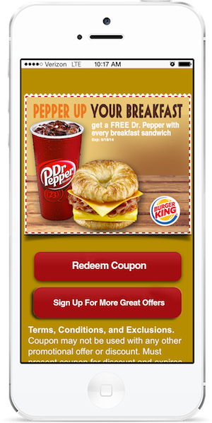
Too often, advertisers get so caught up with the ad unit itself that they drop the ball when the time comes to follow-through. The ad is just one part of a bigger overall picture, after all, so an important part of every mobile ad design is ensuring that the ad is an appropriate fit with the post-click experience.
Everything needs to be cohesive, from the visuals (style, font, color), to the personality (humorous ads should lead to humorous post-click experiences), to the ad message itself (i.e. if an ad promises “20% Off!” then the landing page needs to deliver on that promise). A lack of this sort of cohesion decreases an ad’s sense of legitimacy in the eyes of the customer.

